Better Apps Start With Context
How I use Runable, Mobbin MCP and a clear product brief to build apps with AI. Two real projects, visual breakdowns, prompts to copy, and the harness behind the work.



My friends in finance were spending hours scrolling LinkedIn for openings. I wanted something quieter: set your preferences once, then hear about a role when it actually fits.
That became First Seat. I used Runable to build the app around that idea. The interface took me two iterations to get to a result that honestly surprised me. Another Runable session built the job-data backend.
The biggest thing I would recommend is giving the model a high-level perspective on what your app should do and be. Who it helps. What should happen. What matters enough to shape every screen.
Then give it good references and room to make design decisions.
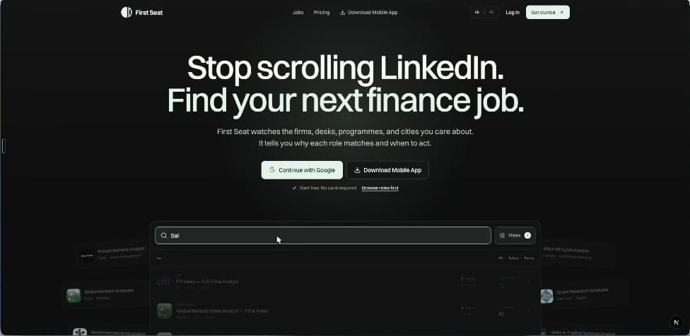
First Seat, built with Runable. Two interface iterations, with a separate Runable session handling the backend.
Start with the person using it
“Build a job board” leaves most of the important decisions open. A person looking for an internship in a particular finance desk has very different needs from someone casually browsing every job in London.
For First Seat, the useful context was that my friends knew the kind of role they wanted. The exhausting part was checking for it repeatedly. The app needed to understand their preferences and make a match understandable.
actually fits me.”
The user’s goal decides what the interface needs.
The data side pulls roles from the careers feeds of 400 finance companies. The filters reflect the way those roles work: desk, asset class, seniority and programme. That domain context gives the model something meaningful to design around.
My tip: write one sentence describing what someone should accomplish. Use it to judge every proposed feature. For this app: “I set my rules once and find out when a relevant role appears.”
Research competitors, then look closely at UI
I do both before building. Competitor research helps me understand the product. UI research helps me communicate taste and learn how other products handle a particular interaction.
For competitors, I want to know who each product serves, the main task, where the experience becomes frustrating, and what my app needs to do differently. Ask for source links beside each finding. Open the important ones yourself.
For UI, I highly recommend Mobbin MCP. It lets a connected AI client search real interfaces and receive the screen images. This is useful when you know the problem you are solving but cannot name the design pattern you need.
Those search themes came from my Micro Startup Studio project. I looked for a studio hero, project grids and, later, a specific kind of footer. Research can continue when you reach a new part of the interface.
The useful extra step: annotate each reference. “I like the readable density of this job list.” “This filter keeps the current selection visible.” “This empty state explains what to do next.” The model gets your reasoning along with the picture.
Here is a research prompt you can adapt:
I'm building [product] for [audience]. Their main problem is [problem].

Research direct and adjacent competitors. Explain their core flows,
where users spend effort, and useful gaps. Link the source for each
finding and separate observations from your interpretation.

Use Mobbin to find references for [the specific screen or interaction].
For each reference, explain what works and how it could inform our app.

Give me a short product brief and a small, annotated reference set.
Flag missing context before we start designing.
Connect Mobbin MCP
Mobbin requires a Pro, Team or Enterprise plan for MCP access. In Claude, open Customize → Connectors → Add → Browse connectors, choose Mobbin, connect, and authorize your account. Mobbin recommends this shared connector setup for Claude Code too. Follow the official Claude setup or choose your supported client.
If you specifically want a CLI-only Claude Code connection, Mobbin documents this alternative:
claude mcp add mobbin --scope user --transport http https://api.mobbin.com/mcp
claude /mcp
Select Mobbin and authenticate. The CLI instructions cover that route.
I use Mobbin in a supported client for the research step. You can bring the resulting reference notes and images into your Runable brief.
Give the model the philosophy and functionality
I explain what the app should feel like to use, which functions matter, and what makes this particular product useful. I leave the exact layout open initially.
“Focused and credible” becomes useful when you explain why: the person is making a career decision, needs to understand the role quickly, and should see relevant details before decorative content.
Finance candidates searching for a specific next role.
Broad job feeds create hours of irrelevant scrolling.
Set precise rules once. See relevant openings and why they match.
Browse roles, filter them, save preferences, manage alerts.
Focused and credible. Useful information comes first.
Ask what is missing. Propose the structure and visual direction.
The model should gather as much relevant context as it needs. Ask it to read the material, identify the missing pieces, and ask questions that could change the build. That helps avoid committing to an interface built around a wrong assumption.
I find the current models remarkably good at working from this level of direction. On Runable, two iterations got me to an interface I was happy with. The research and the way I explained the product were part of that process.
This is a reusable example brief, written for this guide:
Build a finance job app for candidates who already know the kind of
role they want and are tired of checking broad job feeds repeatedly.

The outcome: set precise preferences once, find relevant openings,
understand why they match, and control when to receive alerts.

Core functions: browse roles, filter by finance-specific criteria,
save preferences, inspect a role, and manage alerts.

The experience should feel focused, credible and calm. Prioritize
the information someone needs to decide whether a role fits.

Use the attached research and annotated UI references to understand
the product and my taste. Be creative with the composition and visual
direction. Propose the structure that best serves these users.

First gather the context you need. Ask questions that materially
change the product. Summarize the essential flows and assumptions.
Identify the existing backend, data fields and integration boundaries
before implementing against them.

Once the direction is clear, build it and exercise the main flow.
Check mobile, keyboard use, empty results, loading and errors.
Report what you verified and what still needs checking.
When work is split across sessions, the handoff matters. Give the next session the actual data fields, endpoints, example responses and relevant decisions. A nice-looking interface still needs to agree with the backend.
Explore directions, then get specific
My Micro Startup Studio portfolio is a separate example, built in Claude Code. I went back through the project transcripts to look at what actually helped.
I started with the purpose of the site, our real products and founder assets, and references. I asked for five distinct directions. Then I chose Cobalt.
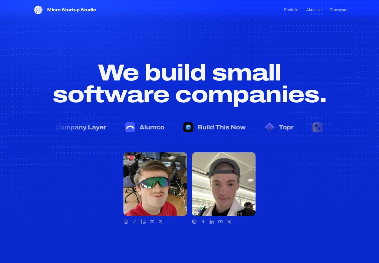
The live Cobalt direction. A separate Claude Code project, used here to show how research and feedback shaped a real design.
Once the direction works, refine the named parts.
After that, my instructions became specific: make the hero full height, show the founder photos by default, use ASCII on hover, remove noisy statistics, and make the product sections explain the actual products.
That is the sequence I recommend. Early on, communicate purpose and taste. Once you choose a direction, give precise feedback on the result in front of you.
“Make it more polished.”
Keep Cobalt and the current layout. Show the founder photos by default. Reveal ASCII on hover and keyboard focus. Check that the photos remain visible on mobile.
“Keep, change, check” is a useful structure. State what you like, name the part that needs work, and describe how to verify the change. It helps preserve the decisions you already made.
Use a stronger model where judgment matters
For building, try Claude Fable 5.1 or GPT-6 Astra. That is my current recommendation for the product decisions, implementation and difficult debugging.
A smaller model can do much of the collection work: finding competitor pages, organizing feature lists, and turning source material into notes. Review the findings before the stronger model builds on them. Deep research that changes the product still deserves careful judgment.
Competitor links, feature inventory, source notes
or GPT-6 Astra
Product decisions, architecture, UI and difficult fixes
Open the app. Exercise the flow. Inspect the evidence.
This is how I would divide the work in a workspace where I can choose models. Use the strongest builder available in your environment and give it the research you have already checked.
The harness matters too
The model needs a way to read your project, use tools, make changes, see the result and carry useful decisions into the next step. That surrounding setup is the harness.
Runable was the build workspace for First Seat. For local projects, Build This Now is the harness I work on with Koen, called Codekit in the repository. It brings project instructions, skills, workflows, tools and verification into the development process.
Looking through Codekit, two principles are particularly relevant here. Its design guidance puts hierarchy first and asks whether the screen serves this specific product. Its evidence guidance requires a check that actually ran before a claim that something works.
You can apply that even with a small setup:
- Keep a short product brief in the project. Audience, outcome, essential flows, constraints and references.
- Save decisions as you make them. The chosen direction, why it won, what must stay, and the backend contract.
- Give the model access to the result. A browser and screenshots let it inspect the UI it built.
- Define what “works” means. Exercise the real flow, including saved state, errors and mobile use.
Start with the framework overview if you want the local setup. The installation guide is available inside the member documentation.
Try it with one useful flow
Pick an app idea with a clear user and one meaningful outcome. Research the alternatives. Find UI references and explain your choices. Give the model the product perspective, then let it propose a coherent interface.
In Runable, paste the brief, add your reference material, answer the questions that matter, and review the generated app. Refine a specific part at a time. Before sharing it, go through the task as a real user: can you finish it, does the result persist, and is it still clear on your phone?
For First Seat, the idea started with my friends wasting time on job feeds. Having that purpose made it much easier to decide what the app should become.
Try Runable with your own idea, using the brief above as a starting point.
Tools and further reading
- Runable, the workspace used for First Seat. This article is part of my Runable partnership.
- Mobbin MCP overview, supported plans and what the connector returns.
- Mobbin setup in Claude and Claude Code CLI.
- Claude Fable and GPT-6 Astra, official model pages.
- Micro Startup Studio, the separate portfolio case study.
- Build This Now framework, the local harness discussed above.
The First Seat account is my own experience. The Micro examples were checked against my August 30 to September 1 project transcripts and the resulting site. Sample prompts are prepared examples you can reuse. Tool setup and model links were checked on September 10, 2026.
Lock Your npm Installs
One npm install was enough for the CHAINDROP worm to hunt Claude, Codex and Cursor keys. The four free checks I run now, before install, commit, push and every Claude Code launch, with every command to copy.
Jalapeño vs Nvidia
OpenAI's first chip went from first design file to tape-out in nine months and beat Nvidia Blackwell per watt on SemiAnalysis's InferenceX, with kernels written by its own models. The numbers as charts, every source linked, the caveats a chip person would raise.